(scroll down for English version)
Ist eigentlich eine Ausstellung, an der ausschließlich Frauen beteiligt sind, zwei Malerinnen und eine Lyrikerin, per se eine feministische Veranstaltung? Eines ist sicher: Weibliche Benachteiligung bleibt ein Dauerthema im Kunstbetrieb, solange der internationale Auktionsmarkt immer noch zu 98 Prozent männlich dominiert wird, was heißt, dass man als Künstlerin von Vornherein schlechtere Karten hat.
Und wo könnte der Feminismus besser aussehen als in einem Shopping-Center? Der Offenbacher Kunstverein befindet sich mitten in einem Einkaufsparadies – ein Kunsttempel im Konsumtempel. Kunst und Konsum sind tatsächlich nicht sehr weit voneinander entfernt, denn Objekt und Ware finden auch in einer Kunstinstitution zueinander: Geboten wird dort eine Ware für die Augen, die allerdings zuvorderst nicht als kommerziell verortet wird, die aber, und da gleicht sie der Konsumware, Aufmerksamkeit begehrt. Sie richtet sich an den Gesichtssinn, der für die Aufnahme von optischen Reizen und deren Verarbeitung zuständig ist. Nichts anderes geschieht beim Shopping.
„Jetzt kreisen unsere Arbeiten seit Jahren um die Suche nach dem authentischen Glamour“, umschrieb mir die Lyrikerin Julia Mantel die Gemeinsamkeiten der drei Frauen. Was könnte den „authentischen Glamour“ schöner verdeutlichen als Julias dunkle Stimme, mit der sie ihre Gedichte vorträgt und in pfiffigen Wortspielen voller Klangfiguren, Kunst und Leben zusammenbringt. Ihre Verse lassen generationsspezifische Erinnerungen aufkommen. Da sind zum Beispiel die Zeilen „sie gefallen mir / sie gefallen mir / sehr“[1], die als Romy-Schneider-Zitat aus einer deutschen Talkshow von 1974, dem Geburtsjahr der Lyrikerin, erkannt werden können, eine öffentliche Ermächtigung der Schauspielerin, wagte damals doch kaum eine Frau, diese Worte zu einem Mann zu sprechen.
Was macht ein Frauenleben aus zwischen dem schnöden Alltag und dem authentischen Glamour? Die Kategorie „Stricken“ auf Mantels Unvermittelbar-Blog[2] stellt selbstbewusst das Handwerk neben die Poesie – hier darf geshoppt werden! – Sie hinterfragt keineswegs weibliche und dabei oft der Frau unterstellte dilettierende, sich handwerklich äußernde Kreativität. Darüber sind wir doch seit Rosemarie Trockel längst hinaus, die diese Hinterfragungen in die bildende Kunst gebracht hat und heute zu den erfolgreichsten weiblichen Künstlerinnen gehört. „ich darf so bleiben wie ich bin“, schreibt die Dichterin, „echt jetzt?!/ weiß ich jetzt ehrlich gesagt gar nicht / wie ich damit umgehen soll.“[3] Dem weiblichen Streben nach Vervollkommnung, Verschlankung, Verschönerung lassen diese Zeilen einfach die Luft raus!
Und der Glamour? Mantel schreibt: „oft trügt der schein nicht nur, er trübt / er betrübt vielmehr.“[4] Dabei steht Dir/uns allen ja eigentlich die Karibik zu, so der Titel ihres vierten Lyrikbandes. Es reicht aber nur zu einer Fototapete mit Sonnenuntergang in Blutorangenrot[5], in der Farbe des Saftes, den man bei Aldi bekommt. Das ist komisch und tragisch zugleich.
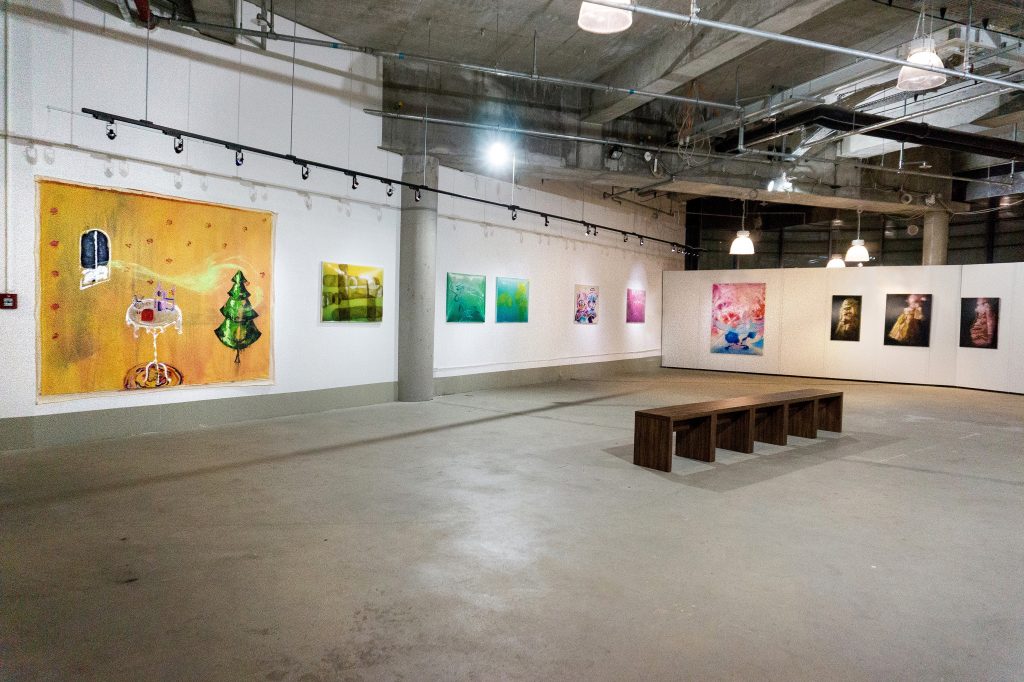
Julia Mantel kreiert eine sprachliche Atmosphäre, die das Banale des Alltags benennt, doch in eine offene interpretierbare Form einbettet und an den Dialog der Malerinnen, der schon seit der gemeinsam besuchten Städelschule währt und bisher in der in Düsseldorf und Essen gezeigten Schau easymagic123 einen Reflektionsraum bot, so offen und frei andockt, dass Berührungen vage bleiben, aber sich doch ein persönliches Verhältnis dazu nicht ausblenden lässt.
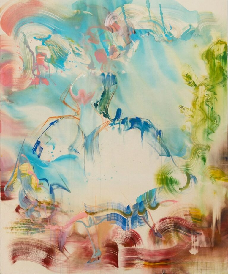
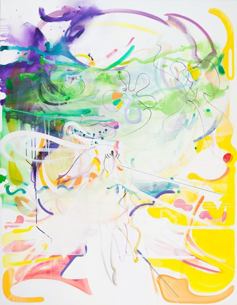
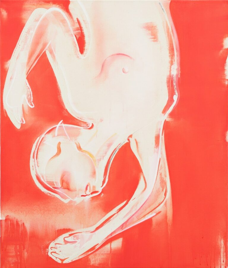
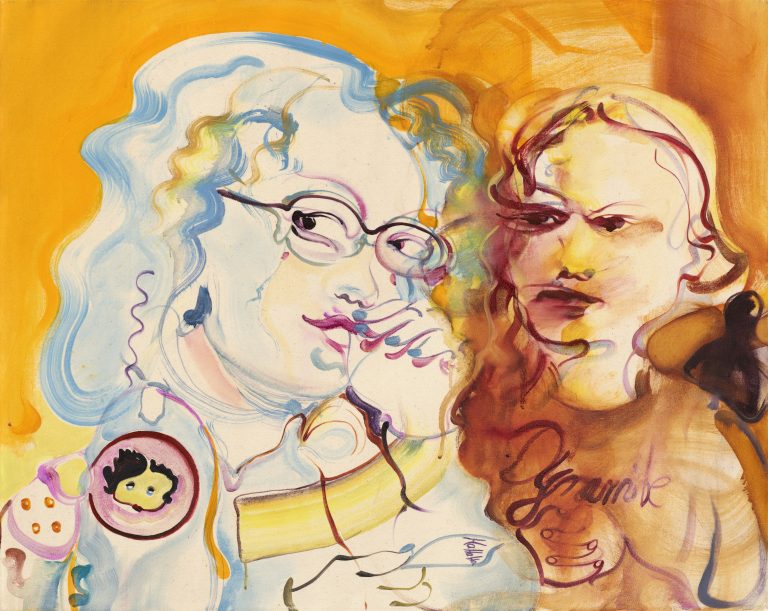
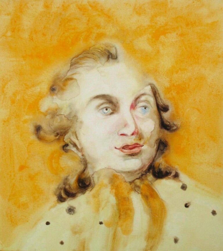
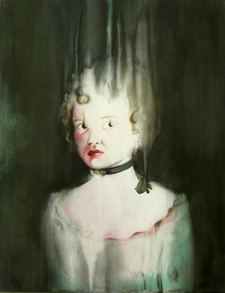
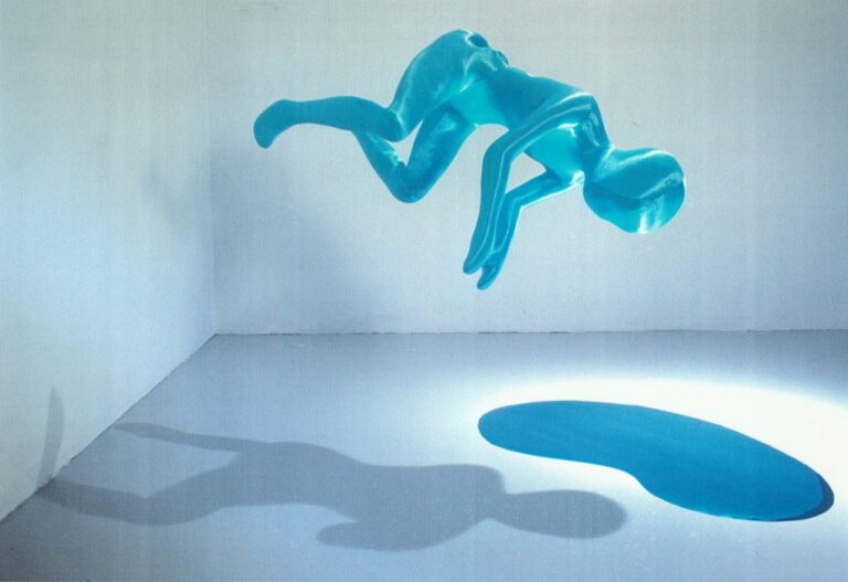
Bei der Betrachtung der Motive, die Julia Jansen auf Leinwand bannt, stellt sich individueller Blickbezug her. Es sind Erinnerungen eigener Empfindungen gegenüber dem Haptischen, Glänzenden, Verlockenden eines Gegenstandes, der von der Malerin zeit- und ortlos spektakulär-unspektakulär dargeboten wird. Indem wir also über den Gegenstand nachdenken, den Jansen zur Betrachtung inszeniert, hat sie uns auch schon gewonnen über dieses ihren Bildern innewohnende übernatürliche Leuchten. Die Veredelung des Gegenstandes, sein Glamour, verweist auf das eigentliche Thema: die Malerei. Malerei ist Illusion, und Malerei ist Licht. Die Essenz dieser Malerei ist das Malerische selbst, in einer Art Sfumato von atmosphärischen Schleiern überzogen wie nicht scharfgestellt, mal Stoff und Figur, mal abstrahierend und glänzender Raumkörper. Wichtig ist der Künstlerin, dass der Pinselstrich erkennbar bleibt und nicht alles mit dem Blender verrieben wird. Jansen nutzt fotografische Vorlagen, die sie selbst herstellt. Die Stoffarrangements ihrer „Torsi“ werden mit einem Scheinwerfer beleuchtet und fotografiert. Das Modell und seine Fotografie bilden die Vorlagen, die dann auf Leinwand übertragen werden. Neuerdings arbeitet Jansen mit einem Malprogramm, mit dem sie Farben und Lichteffekte mühelos am Bildschirm verändern kann. Das digitale Ergebnis übersetzt sie dann in Malerei. So sind diese durch Lichthöhungen an Kissen erinnernde Formen entstanden, die keinesfalls selbst Kissen sind wie bei Gotthard Graubners Kissenbildern, sondern sich aufgrund ihrer Lichtreflexe aus der flachen Bildebene räumlich hervorheben. Sie werden nach den verwendeten Farben benannt, wie „Magenta, Zinkweiss“ oder „Cyan, Hellgelb“.
Jansen spielt mit unserer Wahrnehmung und macht deutlich, dass ihre verführerisch „luxuriöse“ – das Adjektiv nutzt sie selbst – von Licht durchwirkte Malerei (von Lux, lat. Licht) Illusion ist. Annelie Pohlen beschrieb das Konzept so: „Das Licht gaukelt vor. Die Lichtregie im Bild gaukelt nicht minder vor. Dabei setzt Julia Jansen alles daran, der Wahrnehmung dieses Gaukelspiel tatsächlich vor Augen zu halten.“[6] Während die Malerei selbst authentisch bleibt, ist die in der Malerei reflektierte Wirklichkeit eine trügerische Erscheinung. Dazu nutzt Jansen Fotoästhetik, wie sie in einem Künstlerinnengespräch mit Bettina Sellmann sagte.[7] Es sei außerdem Luxus, sich Dinge via Malerei anzueignen, ohne sie besitzen zu müssen. Wir erinnern uns an Julia Mantels Bild der Karibik, das als Fototapete daherkommt.
Jansen macht den Sehprozess deutlich. Sie tritt mit uns in den Dialog, was eine Steigerung erfährt, durch den Dialog mit der Malerin Bettina Sellmann, die wie sie als Meisterschülerin bei Thomas Bayrle ihr Studium abschloss. Beide kennen sich seit 1992 und erzählen, dass sie damals stundenlang im Atelier ihre Bilder diskutiert haben. So unterschiedlich beider Malerei ist, so gut passt sie zusammen. Begründen lässt sich dies wohl mit den Qualitäten des Malerischen: Farbe, Textur, Oberfläche und Inszenierung.
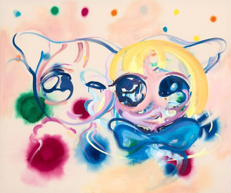
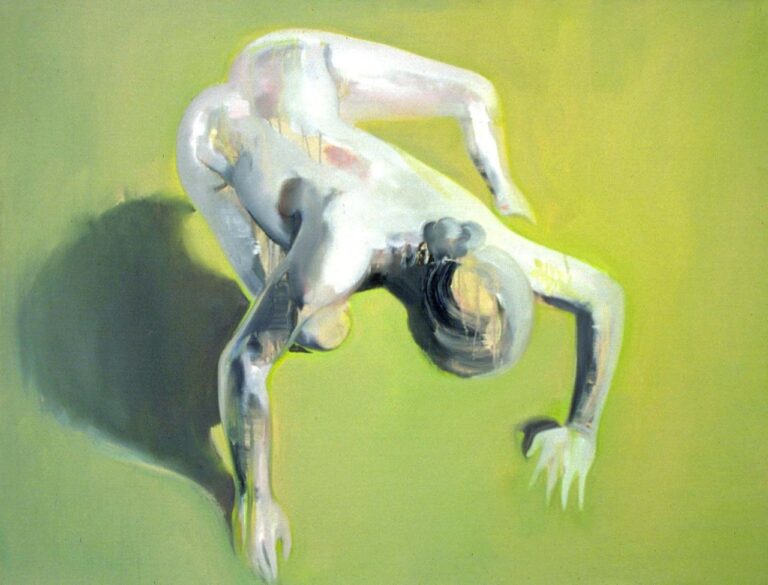
Bettina Sellmann verweist auf das „Bad Painting“ der 1980er/1990er Jahre, das sie aus weiblicher Perspektive weiterverfolge. Und weil man sich als Künstlerin in jener Zeit absichtsvoll von allem distanzierte, was vielleicht als „von einer Frau gemalt“ wahrgenommen werden konnte, war dies für sie der Anlass, eben hier anzusetzen und zu schauen, wie sehr das Süß-Elegante ausgereizt werden kann.
„Cute Empowerment“ nennt Annekathrin Kohout[8] die Bewegung, die über das Internet erschienen ist und sich den dunklen Seiten des Netzes entgegenwirft, um in rosa-glitzernden Kawaii-Figuren die Niedlichkeit als positiven Stimulus zu nutzen. Takashi Murakami hat diese Manga-Bildsprache zum Geschäftsprinzip gemacht. Bettina Sellmann nutzt ihre pastellfarben-zuckrige Barock- und Kawaii- oder Kidult-Figuren, um sich einer Ästhetik zu bemächtigen, die bislang einer klischeehaften und diskriminierenden Zuweisung diente. Durch die Affirmation überwindet sie Vorurteile, lässt diese transparent werden.
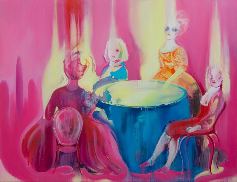
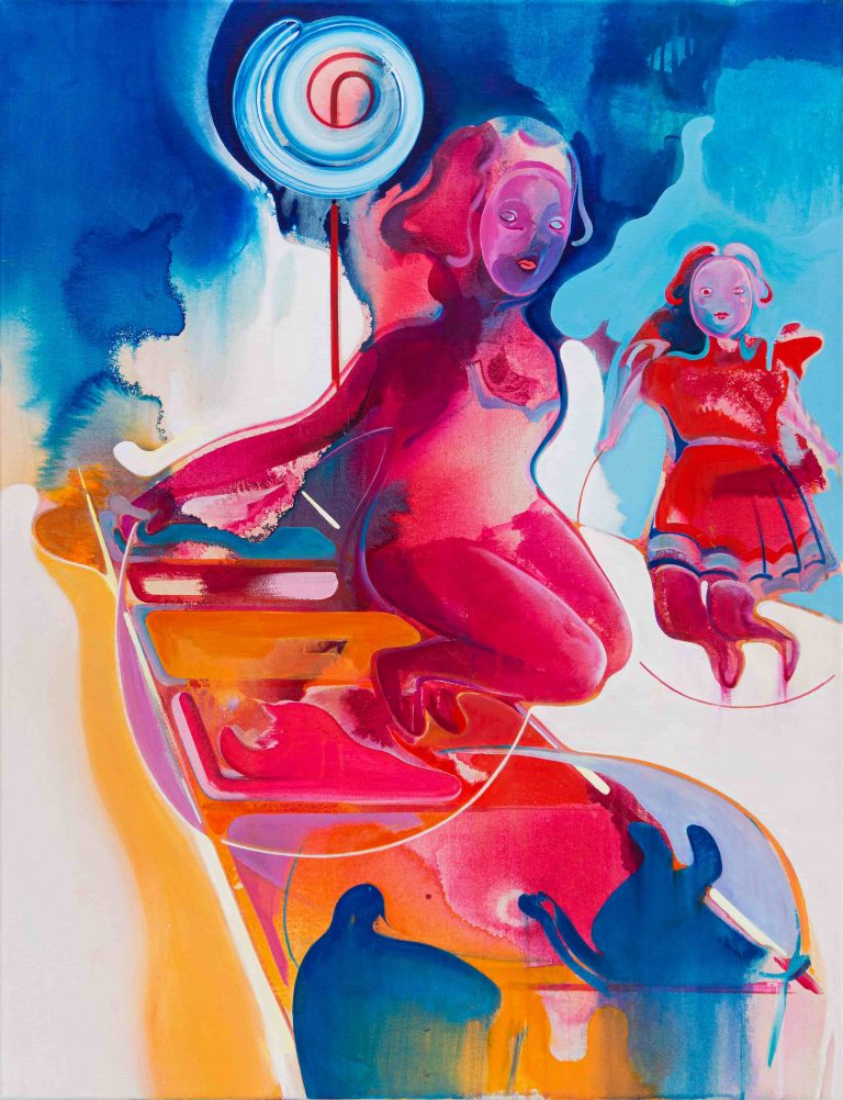
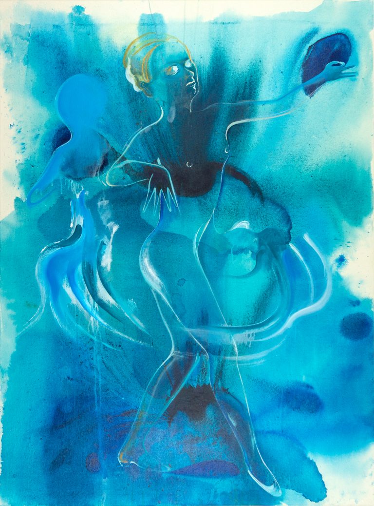
Auf dem großen „Weihnachtsbild“ zieht sie alle Register der Malens: lasierender Auftrag, herabtropfende dünne Farbe, Farbdruck und 3D-Paste bilden einen Fest-Traum mit rosenbedruckter Tapete ab. Daneben versammelt sie aktuelle Werke mit Verweisen auf ihre Motive, die sie aus der Kunst des Barock und der Manga-Welt bezieht. Die Gesichter und Figuren erscheinen fluide, lasierend-leicht und flirrend-bewegt auf der Leinwand, kindliche Farben deuten riesige Augen, sich auflösende Gesichter und bewegte Figurinen an. Der „Enlightened Dancer“ wirkt wie ein in eine blaue Explosion getauchtes durchscheinendes Negativbild. „Electric Doll“ scheint sich ins Ungefähre aufzulösen. Die Puppe ist ganz und gar transparent, aber immer noch Figur. Obwohl Sellmanns Werke zeichnerisch wirken, wie Julia Jansen bemerkte, trennen sie Welten von der Comiczeichnung. Dazu sind sie viel zu bewegt, es fehlt ihnen das Statische der Umsetzung.
Sellmann nutzt ihr malerisches Können, und das gilt auch für Julia Jansen, um Transparenz/Stofflichkeit und Bildraum, Inszenierung und Oberfläche zum eigentlichen Gegenstand ihrer Bilder werden zu lassen. Das Immaterielle, Illusionistische benennt das Objekt. Das Comichafte wandelt sich um in Malerei. Die Fiktion berührt die Wirklichkeit, wenn Julia Jansen betont, dass sie sich den Gegenstand nicht kaufen müsse, um ihn zu besitzen. „Ich kann ihn malen.“ Und das will sie zelebrieren: „Warum soll ich Asche malen, wenn es auch Gold, Blingbling und Lichteffekte gibt?“
In beider Werken wird die Fiktion lebendig: Drapierten Hüllen, glänzenden Oberflächen bei Jansen, Kawaii- und Barockfiguren bei Sellmann wird eine Bühne geschaffen. Die Stofflichkeit zeigt sich im besten Licht, wird mit rauschhaftem Farbauftrag umkreist und mit Glitter bestäubt. Authentizität stellt sich über die Offenlegung der Fiktion ein. Das macht dann den „authentischen Glamour“ aus. Julia Mantel ist es wichtig, in ihren Versen einen „Sound der Zeit“ zu finden, der Ambivalenzen zur Sprache bringt und als Reaktion auf unsere Gegenwart verstanden werden kann: auf Instagram-Inszenierung, also jener medialen Bühne des Egos bis hin zu medialen Manipulationen oder der aggressiven Sprache in den Social-Media-Kanälen. So bietet easymagic123 das Passwort zu mehr Zärtlichkeit, Cuteness und Glanz gegen die Düsternis.
Ich wollte die Karibik und bekomme Aldi. Aber das Orangerot ist glamourös. Und darauf allein kommt es an!
[1] Julia Mantel, Wespennest, in: Dies., Wenn Du eigentlich denkst, die Karibik steht Dir zu. Gedichte, Edition Faust, Frankfurt 2021, S. 76.
[2] https://unvermittelbar.de/
[3] Julia Mantel, ich hab da glaub ich was für dich: so n tapetenhersteller aus der pfalz (international) braucht ne messehostess (mehrsprachig), fand dich sehr beeindruckend, in: s. Anm. 1, S. 16.
[4] Julia Mantel, da hat sie was eigenes, in: s. Anm. 1, S. 34
[5] S. Anm. 3, S. 13.
[6] Annelie Pohlen, Malerei – Konzeption und Wahrnehmung zwischen Begriff und Verführung, in: Kunstforum International, Band 189, Jan./Febr. 2008, S. 259.
[7] Künstlergespräch zwischen Bettina Sellmann und Julia Jansen, anlässl. der Ausstellung easymagic123, Baustelle Schaustelle Essen und Düsseldorf, Juni 2020, https://www.youtube.com/watch?v=6CeAYf9ayhA (abgerufen am 2.12.2021).
[8] Vgl. Annekathrin Kohout, Cute Empowerment. Niedlichkeit und Popkultur, Vortrag, About Pop-Konferenz am 30.10.2021 in Stuttgart, https://www.youtube.com/watch?v=FHtTt8Dt-LY (abgerufen am 2.12.2021).
Isa Bickmann: GLAMOROUS AND FABULOUS – Opening speech for the exhibition EASYMAGIC123 at Kunstverein Offenbach, December 2021
Is a collaboration in which only women are involved––two female painters and a female poet––per se a feminist event? One thing is certain: Discrimination against women will remain an ongoing issue in the art business as long as the international auction market is still 98 percent male-dominated––meaning as a female artist you always start off with a disadvantage.
Lyricist Julia Mantel paraphrased what the three women have in common as follows: „For years now our oeuvres have been revolving around the search for authentic glamour.“ What could illustrate „authentic glamour“ more beautifully than Julia’s dark voice, with which she recites her poems––bringing together art and life in clever puns full of sound figures. Her verses evoke generational memories. There are, for example, the lines „you please me / you please me / very much,“[1] which can be recognized as a Romy Schneider quote from a German talk show in 1974, the year of the lyricist’s birth. They are a public empowerment of the actress: Back then, hardly any woman dared to speak such words to a man.
What makes up a woman’s life between the dull daily grind and authentic glamour? The „Knitting“ category on Mantel’s blog “Unvermittelbar”[2] (in English: unplaceable) confidently places craft alongside poetry. It in no way questions female creativity, which is often assumed to be dilettante and expressing itself through craftsmanship. We have long since moved beyond this thanks to Rosemarie Trockel, who brought this questioning into the visual arts and today is one of the most successful female artists. „i may remain as i am,“ writes the poet, „for real now?! / i honestly don’t know now / how to deal with it.“[3] These lines simply deflate the female striving for perfection, slimming, beautification!
And the glamour? Mantel writes: „appearances are often not only deceptive / they cloud / rather afflict.“[4] You/we are all actually owed the Caribbean, according to the title of her fourth volume of poetry. However, all we get is a photo wallpaper with a sunset in blood-orange red[5], the color of the juice you get at Aldi. It is funny and tragic at the same time.
Julia Mantel creates a linguistic atmosphere that names the banality of everyday life, yet embeds it in a form that is open to interpretation. Thus she joins the dialogue of the painters, which has been going on since the time they attended Städelschule together and has so far offered a space for reflection in the show easymagic123 in Düsseldorf, Essen and Offenbach am Main. Mantel joins in such an open and free way that connections remain vague, yet a personal relationship to the dialogue cannot be ignored.
When looking at the motifs that Julia Jansen captures on canvas, an individual perspective is created. By presenting an object in a time- and place-less spectacularly unspectacular way, the painter evokes memories of personal feelings towards its haptic, shiny, enticing qualities. By thinking about the object that Jansen stages for contemplation, she has already won us over through this supernatural glow inherent in her paintings. The refinement of the object––its glamour––points to the real subject: painting. Painting is illusion, and painting is light. The essence of this painting is the painterly itself, covered in a kind of sfumato of atmospheric veils as if out of focus, sometimes fabric and figure, sometimes abstract and shiny spatial body. It is important to the artist that the brushstroke remains recognizable and not everything is faded out with the blender.
Jansen uses photographic templates that she makes herself. The fabric arrangements of her „torsi“ are illuminated with a spotlight and photographed. The model and its photograph form the templates, which are then transferred onto the canvas. Recently, Jansen has been working with a paint program that allows her to change colors and lighting effects effortlessly on the screen. She then translates the digital result into painting. This is how the forms came into being that are, due to the highlights, reminiscent of pillows. They are by no means pillows themselves, as are Gotthard Graubner’s pillow paintings, but stand out spatially from the flat picture plane due to their light reflections. They are named after the colors used––such as „Magenta, Zinc White“ or „Cyan, Light Yellow.“
Jansen plays with our perception and makes it clear that her seductively „luxurious“––she uses the adjective herself––painting, which is permeated with light (from Lux, Latin for light), is an illusion. Annelie Pohlen described the concept as follows: „The light is illusory. The handling of the light in the painting creates no less of an illlusion. In doing so, Julia Jansen does everything she can to actually make perception aware of this conjuring game.“[6] While the painting itself remains authentic, the reality reflected in the painting is a deceptive appearance. To this end, Jansen uses the aesthetics of photography, as she said in an artist talk with Bettina Sellmann.[7] She also said it was a luxury to appropriate things via painting without having to own them. We are reminded of Julia Mantel’s image of the Caribbean, which comes in the shape of a photo wallpaper. Indeed, in Jansen’s series of works „Tropics and Figures,“ the illusion of a landscape with palm trees appears as the backdrop to people communicating with each other. They only at first glance resemble vacationers. As rhetorical figures they reveal the double meaning of the word „tropics“––by way of the titles of the paintings, which speak of „Apology,“ „Noble Lie,“ „Propaganda,“ and „Compromise.“ Here the painted narration proves to be part of an evocative game that questions motif, appearance, and interpretation––in other words: the essence of painting.
Jansen enters into a dialogue with us, which is heightened by the dialogue with the painter Bettina Sellmann, who, like her, graduated as a master student of Thomas Bayrle. Both have known each other since 1992 and mention that they spent hours discussing their paintings in the studio at the time. As different as both their paintings are, they fit together very well. This may be explained by the qualities of the painterly: Color, texture, surface and staging.
Bettina Sellmann refers to the „Bad Painting“ of the 1980s/1990s, which she develops further from a female perspective. The fact that female artists at that time deliberately distanced themselves from anything that may be perceived as „painted by a woman,“ was the trigger for her to start precisely there and to see how much the sweet and elegant can be pushed.
„Cute Empowerment“ is what Annekathrin Kohout[8] calls the movement that has appeared on the internet and confronts the darker impulses on the web in order to use cuteness as a positive stimulus––with pink glittery kawaii figures. Takashi Murakami has turned this manga imagery into a business principle. Bettina Sellmann uses her pastel-colored, sugary baroque and kawaii or kidult figures to seize upon an aesthetics that previously served a clichéd and discriminatory attribution. Through affirmation she overcomes prejudices, makes them transparent.
In her often large-format paintings, she pulls out all the stops of painting: glazing as well as impasto application, dripping thin paint, color printing and the use of stencils. Faces and figures in motifs that she draws from the art of the Baroque and the manga world appear fluid, translucently light and shimmeringly moving on the canvas. Childlike colors suggest huge eyes, dissolving faces and moving figurines. The „Enlightened Dancer“ looks like a translucent negative image immersed in a blue explosion. „Shell 1“ and “Shell 2” seem to dissolve into something vague. The knight in „Shell 2“ is entirely transparent but still figure. Although Sellmann’s works seem graphic, as Julia Jansen noted, they are worlds apart from comic drawing. They are far too moving and their execution is not static.
Sellmann uses her painting skills, and this is also true for Julia Jansen, to let transparency/materiality and pictorial space, staging and surface, become the actual subject of her paintings. The immaterial, the illusionistic names the object. The comic-like transforms into painting. Fiction touches reality when Julia Jansen emphasizes that she does not have to buy the object in order to own it. „I can paint it.“ And she wants to celebrate that: „Why should I paint ashes when there is also gold, bling-bling and light effects?“
In both oeuvres, fiction comes to life: Draped sheaths––shiny surfaces in Jansen’s case, kawaii and baroque figures in Sellmann’s–– are given a stage. Materiality shows itself in its best light, is circled in with intoxicating application of paint, and dusted with glitter. Authenticity is established through the disclosure of fiction. This is what constitutes the „authentic glamour“. It is important to Julia Mantel to find a „sound of the time“ in her verses that gives voice to ambivalences and can be understood as a reaction to our present––to Instagram staging, i.e. that media stage of the ego, to media manipulations or to the aggressive language in the social media channels. Easymagic123 offers the password to more tenderness, cuteness and sparkle against the gloom: I wanted the Caribbean and I get Aldi. But the orange-red is glamorous. And that is all that matters!
[1] Julia Mantel, wespennest, in: Wenn Du eigentlich denkst, die Karibik steht Dir zu. Poems, Edition Faust, Frankfurt 2021, p. 76.
[2] https://unvermittelbar.de/
[3] Julia Mantel, ich hab da glaub ich was für dich: so n tapetenhersteller aus der pfalz (international) braucht ne messehostess (mehrsprachig), fand dich sehr beeindruckend, in: see footnote 1, p. 16.
[4] Julia Mantel, da hat sie was eigenes, in: see footnote 1, p. 34
[5] see footnote 3, p. 13.
[6] Annelie Pohlen, Malerei – Konzeption und Wahrnehmung zwischen Begriff und Verführung, in: Kunstforum International, volume 189, Jan./Febr. 2008, p. 259.
[7] Artists‘ conversation between Bettina Sellmann und Julia Jansen, on the occasion of the exhibition easymagic123, Baustelle Schaustelle Essen und Düsseldorf, June 2020, https://www.youtube.com/watch?v=6CeAYf9ayhA (accessed on 12/2/2021).
[8] Compare with Annekathrin Kohout, Cute Empowerment. Niedlichkeit und Popkultur, Lecture, About Pop-Conference on Oct. 30, 2021 in Stuttgart, https://www.youtube.com/watch?v=FHtTt8Dt-LY (accessed on 12/2/2021).